


The logic of where some products are placed in our favourite supermarkets is beyond many of us. Over time we come to accept that Biscotti biscuits can be found in the coffee section and move on. But when a brainiac decides product pairings should change and antacid tablets be moved beside the Doritos rather than their natural medicinal habitat, we develop heartburn!
Every day we build mental models around the natural order of things and regularly search and find what we are looking for on the basis of association. Mental models are critical to reducing effort and increase efficiency when conducting those searches. But there is more than one way to search for something and this is why we may find ourselves scratching our heads when searching for Biscotti biscuits in a supermarket we haven’t visited before.
Websites follow the same patterns as supermarkets and if content “aisles” are poorly labelled or content placed in places that defy imagination then prospective customers may not realise the full range of what is available to purchase. Even worse, they are likely to dump you, the cart and run.
So how do we ensure that the architecture of information that we group together on our website is in a format and structure which will best enable those seeking that information? How do we best match the Information Architecture (IA) to the mental models utilising it? And how do we address the competing needs of our internal website stakeholders who wish to prioritise their content above others?
Through multiple comprehensive and complex IA projects, we have discovered that an optimum IA can be achieved if four key steps are followed. This collaborative, iterative process also unifies stakeholders around and evidence led process.
- Understand where we are now
- Design by association
- Test, iterate and test
- A site map is not enough
1. Understand where we are now
Begin by completing a comprehensive review of all data pertaining to how the current site structure is used by visitors. Typical datasets to leverage include page visits and selected entry/exit pages, email and chat enquiries and search enquiries. What are the mental models around online support? Do customers want to self-identify? Are some customer needs currently overlooked or not supported on the current website?
When working with a well-known Australian Energy brand, a review of these types of datasets uncovered many customers were seeking a better deal but content was lacking on the site. The result is visitors using plan pages, offers and comparison tables to figure out if a better deal is available. The data also highlighted a lack of hierarchy, structure and a duplication of content pages within “Help and Support”, “Billing” and “My Account”. Contact details are the most often searched for content and few proceed to self-serve.

The next step in reviewing the current status is to learn which websites from within our direct and indirect competitors are providing the best IA and why. For this energy project our process was to identify the top energy websites globally based on customer task success across 5 distinct usability tasks. Leveraging our recent digital sales energy benchmarks we were able to establish that Energia (Ireland), Momentum Energy and NRG are top performing brands. Mojo, Globird and Alinta on the other hand all ranked at the bottom of the Global Reviews 27 brand leader board.
FIG 1: Top performers IA- Energy

A deeper analysis of the reasons driving this top performance highlighted that these brands place more emphasis on the “product” (i.e. electricity) through prioritisation of IA using position and elevation within the hierarchy. Labelling is more focused on signposting the way to consider a product using both “task” and “topic” approaches. Lower performing brands like Alinta and Globird place greater emphasis on buying the product by prioritising labels such as “sign up” and “join now” as opposed to labels that reflect consideration such as “price plans” seen on higher performing sites.
FIG 2: Bottom performers IA- Energy

2. Design by association using network theory
The next step is to identify content and labels which will be in the new site design for an open card sorting task. In all of our IA projects we have worked with large sample sizes so as to allow for deep segment analysis. For example, when redesigning the global IA of one of Australia’s largest retail banks, 205 participants representing Corporate banking, Business banking and the general public completed an open card sort.
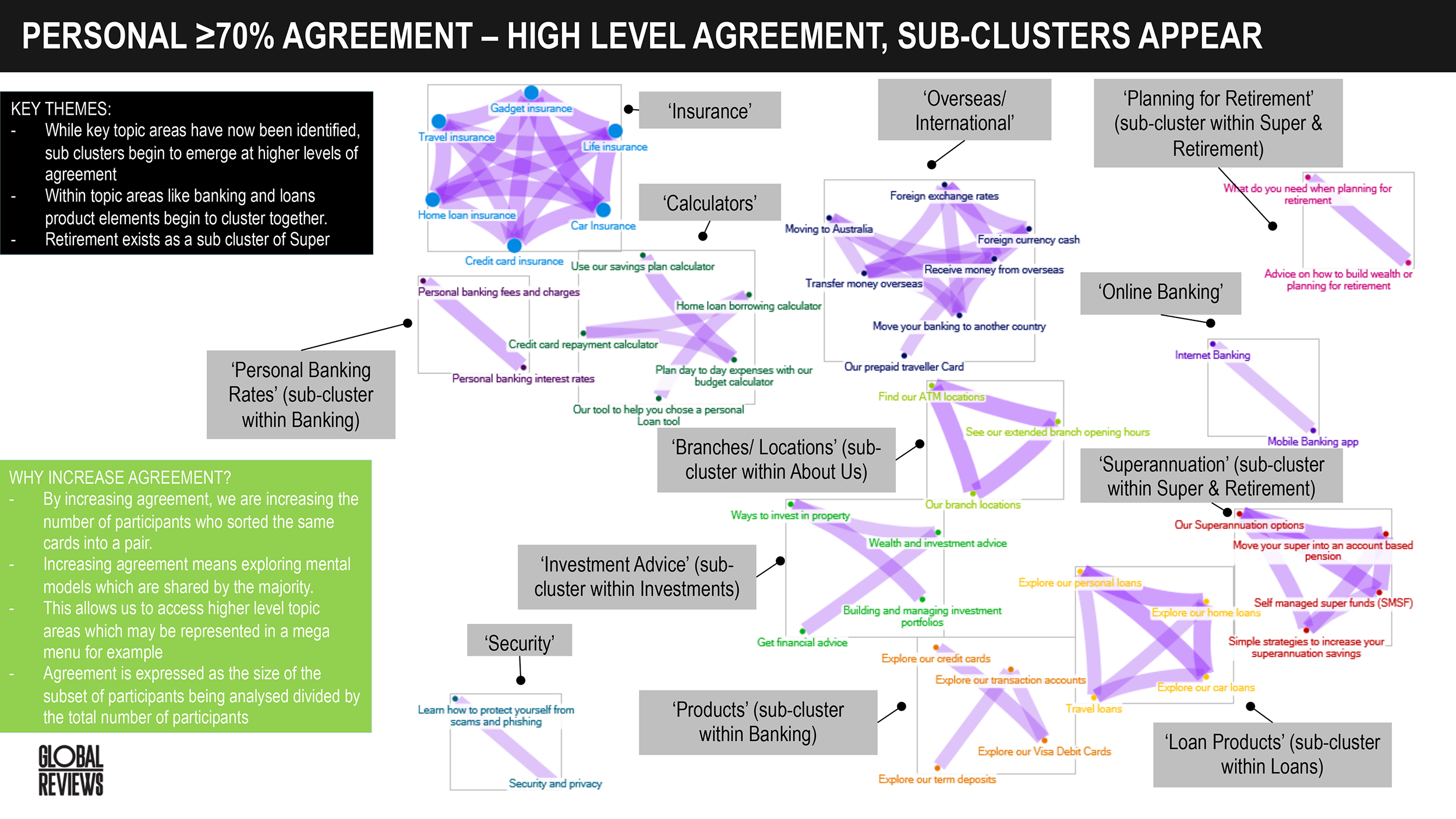
The traditional approach to analysing the results of an open card sort is reliant on subjective analysis with dendograms and histograms to identifying content groupings and mental models. The Global Reviews approach includes this analysis but also allows for analysis of card sorting data in a qualitative manner yet at scale. By identifying card cooccurrence and the number of times two cards are sorted together independent of the group or topic in which they are sorted, we can establish the strong groups between cards to emerge regardless of the different sorting mental models. Cooccurrence is akin to agreement and can be used as a confidence metric to help measure the strength and relationship between two cards or the validity of a card or topic.
This approach utilises node-link graphs which consist of nodes (concept cards) and edges (the relationship between two cards). The strength of a relationship is defined by the level of agreement. The relationship between two cards is visually expressed by features such as weights, clusters, bridges overlay and orphans.
At a 48% agreement level when developing a global IA for an Australian bank it is possible to see how calculators form their own group but maintain strong bridges to loans and Superannuation. This implies a need for content in both places.

Loans becomes a group on its own with bridges to other types of Everyday banking cards.
As the proportional agreement level is increased, mental models which are shared by the majority become more apparent. This allows for access to higher level topic areas which may be represented in a mega menu for example. At 70% agreement level subclusters begin to appear. Within topic areas like banking and loans product elements begin to cluster together while retirement exists as a subcluster of Superannuation.
The output of this analysis is the creation of a site map which is then taken into decision tree testing.
3. Test, iterate and test
When testing the evolution of an existing site map, it is important to test any proposed site map against the current site in order to create a baseline for performance. Our recommendation is to test, iterate and test again until a point has been reached where the new site structure significantly outperforms the current control. The recent global IA redesign for an Australian energy brand had three different IA approaches tested, results compiled, a new IA design developed and tested again against the current site map. A challenger IA is developed from the results from the card sort but with client stakeholder led tweaks that they wish tested.

The IA from the card sort is the recommended IA as derived solely from the card sort results. The overall results saw the IA devised from the card sort results significantly outperforming the current IA and a challenger IA created by the client. The key to the card sort IA was the structures ability to recover well from most users navigating to ‘Electricity and Gas’ as a starting point, which did not contain content related to some tasks. It is the tier 2 level and its simplicity that led to higher success rates for this version. The results also show that users are more likely to think of a “topic label” unprompted but, claim to prefer a “task label”. A key recommendation is to continue with topic-based tier 1 and a blend of topic and task for tier 2 that is led by the page content.
4. A site map is not enough
Once a sitemap has been developed it is necessary to then test performance in a higher fidelity user environment like clickable webpage prototypes. Key decisions need to be made about how elements like mega menus, footers and icon assisted pathways might best support the new IA. This round of testing also presents the opportunity to delve into more device specific considerations when implementing the new IA.
The global IA project with the leading Energy brand in Australia revealed challenges in using the site map developed from previous stages due to execution through the front-end template. This ultimately led to new recommendations around the template such that it could better help site visitors to find what they are looking for.
For example, 50 participants were asked to imagine they are interested in learning if you can get lower rates for using electricity later in the evenings or on weekends and to go to a page on the site that describes how you can get lower rates during specific times.
Many expected the information to be located on the compare plans page, as such the navigation didn’t make sense to them.
A significant number look at the plans themselves for information on rates and success from this pathway is relatively low.

A key learning therefore was to consider regrouping the contents of the mega menu to position content related to plans (i.e. rates and fees) closer to the “Electricity and gas plans” link. It was also recommended to separate support content to help choose the plan (i.e. “How to get the best plan”)
Once in the “Compare plans page” users are reluctant to navigate using the mega menu and focus on finding the content in the main comparison table. From here the key recommendation is to ensure that there are contextual links to more details, such as rates, within the compare plan table.

It was also discovered that users prioritise navigation within the main content area over the right side navigation, even when the link is further down the page and may require scrolling.
Consider designing a navigational system that supports the users focus on navigation options within the main content area of the page.

When considering mobile design, findings highlighted the importance of creating a design solution that can reveal some context for some navigation areas. For this task, more visited the ‘How to get the best plan’ and ‘Energy saving tips’ when using a mobile device as they cannot see some of the tier 3 items surfaced compared to the desktop experience.
Overall, a new IA which performed better than the current site map was identified after the open card sort. However, redesigning an IA is no small task and the opportunity should be taken to iteratively improve the IA with testing against more than one option and testing within a front end execution. Stakeholder confidence in a more collaborative iterative process aids certainty that the end result is the right result for all. We have even gotten to the point of taking bets with our clients over which IA is going to win!

Global Reviews have completed global IA redesign projects in multiple industries including Superannuation, Banking, Higher Learning and Energy. Join us in our upcoming webinar where our CEO Gerard Farrell will detail some of the key insights derived from this novel approach to IA design.


